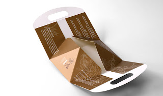
Clever packaging that unfolds to reveal the product inside, but also saves on packaging costs.
Replicating the vintage sweet and crispy flavour, the product is named in “chia̍h tiⁿ-tiⁿ” which means “eat sweet” in Taiwanese. The meaning of the product also becomes the essence of symbolism. Analysing the font of the product packaging with the happy atmosphere, we find an innocent and childlike smiling face is added among the calligraphy indicating good things can happen anytime, just like the brand name “chia̍h tiⁿ-tiⁿ” full of blessings and enjoyment.
This packaging adopts the reduction package of one-piece design that not only enables the box to be assembled quickly, saving the cost of time and labor while packaging, but also decreases packaging expendables. To satisfy the requirements of 3 different flavours in this series, the packaging shares the same style of outer box but uses stickers of different colours and patterns to differentiate among the flavours. In addition to boarding the unity of this product series, enhancing consumers’ impression, the design of sharing the same packaging box also saves unnecessary cost on materials, improving the function.
Disclaimer: Some images hosted on this blog have been collected from external research associates to be presented as stimulus to those seeking news from the cutting edge of packaging. The imagery is not being presented as our own and copyright still belongs to the owner/creator of said work.


No comments:
Post a Comment