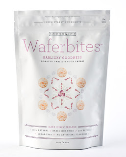
Taking our visual cues from natures fractal patterning and organic beauty, we settled on this eye-catching, clean and all together tasty, yet undeniably healthy looking snack packaging design. The clean, minimal design approach both served to reflect the healthy, natural proposition of the product, and help gain that critical "Shelf pop".
Disclaimer: Some images hosted on this blog have been collected from external research associates to be presented as stimulus to those seeking news from the cutting edge of packaging. The imagery is not being presented as our own and copyright still belongs to the owner/creator of said work.


No comments:
Post a Comment