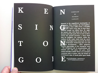
The Royal College of Art's ARC magazine has come back from the brink with a suitably morbid new issue funded by a Kickstarter campaign. Still shaken from its own near-death experience, this makes for a very rewarding read.
That this issue, 16, of its current incarnation belies the fact that the magazine has had a long and celebrated previous life as 'Ark' from 1950-1978, where many now established design names – including David Gentleman, Alan Fletcher and Len Deighton – could be seen working on it.
Despite the subtle name change when it was reborn in 2004, ARC's premise has remained the same: it is an entirely student-run journal that offers a platform for student artwork and writing. According to its first issue's editorial, its purpose was to explore "the elusive but necessary relationships between the arts and the social context" (Alex Seago's history of the magazine is on the Eye website, here). In the case of the current 'death' issue, the writing is now centre stage and the influence of the college's MA Critical Writing in Art and Design course, now in its fourth year, permeates the pages. The theme was chosen as a nod to the fact that this very issue might well have been ARC's last, or may not have happened at all. But thanks to a well-run campaign via the Kickstarter fundraising site (the money raised covered the journal's print and delivery costs) the title lives on and the writing thrives.
Edited by Chairman Griffin, with assistant editors Natalie Ferris, Elizabeth Glickfeld, Sarah Jury and Jamie Sutcliffe, ARC 16 covers a range of deathly subjects. Mixing with 16th century visions of hell is the story of the shooting of Chunee, the elephant who got loose in the Strand in London in 1826; an interview with Julijonas Urbonas, designer of the hypothetical Euthansia Coaster ride (which you can really only enjoy once); and a startling piece on the dehumanising effects of retributive justice by Clive Stafford Smith of human rights charity, Reprieve. There is dark humour and more serious pieces here in equal measure. Designed by Matthew Stuart and Pedro Pina, ARC 16 is appropriately black and white throughout. But despite its funereal appearance, there is some thrilling writing within and ARC is alive and kicking.
Disclaimer: Some images hosted on this blog have been collected from external research associates to be presented as stimulus to those seeking news from the cutting edge of packaging. The imagery is not being presented as our own and copyright still belongs to the owner/creator of said work.


No comments:
Post a Comment