Thursday, 31 May 2012

Scanbox: Turn your iPhone into a scanning platform

Another successful Kickstarter project in its funding infancy, Scanbox has already achieved full funding with almost $70 thousand raised of its $12,500 goal. With 38 days left, it's clear that backers think this product will be a useful tool.

Scanbox, designed by Australian Phil Bosua, Ben Hillier, and Luke Allen, offers a highly portable and utilitarian function—it easily unfolds from a flatpack and snaps together with high-strength magnets to form a scanner platform for the iPhone. The idea was borne from the fact that scanners today—for many people—are not used often, gather dust, take up space, and often require more effort than they are worth.

The box promises to rid users of clunky machines and provide them with a useful and portable version that gets the job done in an arguably better way. The basic version is dependent upon surrounding light conditions, but the "Plus" model offers thin, LED lights to counteract unfortunate lighting situations. The box allows users to "scan" documents and receipts, photograph 3d objects, copy photos and provides a platform for video feed.


Disclaimer: Some images hosted on this blog have been collected from external research associates to be presented as stimulus to those seeking news from the cutting edge of packaging. The imagery is not being presented as our own and copyright still belongs to the owner/creator of said work.

Tuesday, 29 May 2012

Graphic Flier Designs by Viktor Matic


Italy-based designer, Viktor Matic creates these type and shape-centric fliers for wupwup, an interdisciplinary artist collective. The event fliers are eye-catching without blaring their messages through grandiose type and imagery. Instead, they draw viewers' attention with tight color palettes and well-edited content in great typography.

These would look great hanging on a wall, and the fact that they seem to be too nice for a street corner would help them stand out even more amongst other bills.


Disclaimer: Some images hosted on this blog have been collected from external research associates to be presented as stimulus to those seeking news from the cutting edge of packaging. The imagery is not being presented as our own and copyright still belongs to the owner/creator of said work.

Monday, 28 May 2012

100 Notebooks for dOCUMENTA

Over a year in the making, the 100 Notes – 100 Thoughts notebook project has published its final volume to coincide with the opening of the thirteenth dOCUMENTA art festival in Germany next month.


The notebooks are compiled from facsimiles of handwritten notes, artists' books and essays by 100 writers, artists, scientists, philosophers and theorists whose work has a thematic connection to the forthcoming dOCUMENTA festival. Since 1955 the event has taken place every five years in Kassel, based largely in the city's Fridericianum museum. Designed by Italian studio Leftloft the notebooks have been published by Hatje Cantz since March last year and are available in three different formats: A6, A5 and B5. The printed notebooks range from 16 to 48 pages in length and are also available as e-book editions.

Each of the notebooks contains a frontispiece and when arranged together they produce a range of images, including a 1941 photograph of the Fridericianum (shown below) and views of Wilhelm Loth's installation at dOCUMENTA III in 1964.


Leftloft also designed the identity and website for this year's dOCUMENTA (13), which runs from June 9 until September 16. See d13.documenta.de. The series was commissioned by Carolyn Christov-Bakargiev, artistic director of dOCUMENTA (13) and agenct and curator Chus Martinez, the festival's head of department. The series editor is dOCUMENTA (13) head of publications, Bettina Funcke.


Disclaimer: Some images hosted on this blog have been collected from external research associates to be presented as stimulus to those seeking news from the cutting edge of packaging. The imagery is not being presented as our own and copyright still belongs to the owner/creator of said work.

Friday, 25 May 2012

The Mood Synthesizer: An Interactive Instrument Google Doodle


According to Google, Dr. Robert Moog is "something of a patron saint of the nerdy arts and a hero to many of us here." In the 1960s Moog crafted and invented the electronic analog Moog Synthesizer, bringing an entirely new genre of music and sound to the world.

To honor Moog's 78th birthday, Google built a digital, interactive Moog-inspired instrument as their Google Doodle for May 23rd. The Doodle is controlled with either the mouse or keyboard controls and has the ability to record and share the user/musician's creations. It's loaded with capability surprising for a temporary banner and is beautifully crafted.

Moog's synthesizers were some of the first accepted and widely used electronic instruments with quality sound through timbre and tones. Now regarded as art pieces, the keyboards came to define a generation of music and was featured heavily in songs by artists such as The Beatles, The Doors, Stevie Wonder, Kraftwerk and many others.

"Much like the musical machines Bob Moog created, this doodle was synthesized from a number of smaller components to form a unique instrument," says Google Software Engineer, Joey Hurst. "When experienced with Google Chrome, sound is generated natively using the Web Audio API—a doodle first (for other browsers the Flash plugin is used). This doodle also takes advantage of JavaScript, Closure libraries, CSS3 and tools like Google Web Fonts, the Google+ API, the Google URL Shortener and App Engine...Keeping with the theme of 1960s music technology, we’ve patched the keyboard into a 4-track tape recorder so you can record, play back and share songs via short links or Google+."


Disclaimer: Some images hosted on this blog have been collected from external research associates to be presented as stimulus to those seeking news from the cutting edge of packaging. The imagery is not being presented as our own and copyright still belongs to the owner/creator of said work.

Thursday, 24 May 2012

LEGO Releases Team of Athletes for London 2012 Olympics

To celebrate the upcoming London 2012 Olympic Games, LEGO has released an exclusive special edition set of Great Britain Olympic Team mini figurines.

This special edition set features nine athletes, such as a brawny boxer, a stealth swimmer, a relay runner, and a horse rider—to name a few. The set will only be available in the UK. Each LEGO figurine will be priced at £1.99 and will be available in stores from 1 July 2012.


Disclaimer: Some images hosted on this blog have been collected from external research associates to be presented as stimulus to those seeking news from the cutting edge of packaging. The imagery is not being presented as our own and copyright still belongs to the owner/creator of said work.

Wednesday, 23 May 2012

Olympic Ticket Designs Revealed

LOCOG has unveiled the ticket design s for the 2012 Olympic and Paralympic Games. Designed by Futurebrand, the tickets incorporate Someone's pictogram designs along with images of the venues. Each ticket features the relevant sport pictogram with a specific colour scheme for each venue, as well as an image of the venue, to help spectators reach their destination. The tickets also incorporate a number of security measures –  a hologram, a barcode and the name of the booker. Supposedly, every ticket can be traced to the person who purchased it.


Disclaimer: Some images hosted on this blog have been collected from external research associates to be presented as stimulus to those seeking news from the cutting edge of packaging. The imagery is not being presented as our own and copyright still belongs to the owner/creator of said work.

ARC Magazine Lives!

The Royal College of Art's ARC magazine has come back from the brink with a suitably morbid new issue funded by a Kickstarter campaign. Still shaken from its own near-death experience, this makes for a very rewarding read.

That this issue, 16, of its current incarnation belies the fact that the magazine has had a long and celebrated previous life as 'Ark' from 1950-1978, where many now established design names – including David Gentleman, Alan Fletcher and Len Deighton – could be seen working on it.

Despite the subtle name change when it was reborn in 2004, ARC's premise has remained the same: it is an entirely student-run journal that offers a platform for student artwork and writing. According to its first issue's editorial, its purpose was to explore "the elusive but necessary relationships between the arts and the social context" (Alex Seago's history of the magazine is on the Eye website, here). In the case of the current 'death' issue, the writing is now centre stage and the influence of the college's MA Critical Writing in Art and Design course, now in its fourth year, permeates the pages. The theme was chosen as a nod to the fact that this very issue might well have been ARC's last, or may not have happened at all. But thanks to a well-run campaign via the Kickstarter fundraising site (the money raised covered the journal's print and delivery costs) the title lives on and the writing thrives.

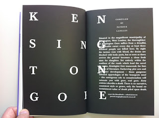
Edited by Chairman Griffin, with assistant editors Natalie Ferris, Elizabeth Glickfeld, Sarah Jury and Jamie Sutcliffe, ARC 16 covers a range of deathly subjects. Mixing with 16th century visions of hell is the story of the shooting of Chunee, the elephant who got loose in the Strand in London in 1826; an interview with Julijonas Urbonas, designer of the hypothetical Euthansia Coaster ride (which you can really only enjoy once); and a startling piece on the dehumanising effects of retributive justice by Clive Stafford Smith of human rights charity, Reprieve. There is dark humour and more serious pieces here in equal measure. Designed by Matthew Stuart and Pedro Pina, ARC 16 is appropriately black and white throughout. But despite its funereal appearance, there is some thrilling writing within and ARC is alive and kicking.


Disclaimer: Some images hosted on this blog have been collected from external research associates to be presented as stimulus to those seeking news from the cutting edge of packaging. The imagery is not being presented as our own and copyright still belongs to the owner/creator of said work.

Tuesday, 22 May 2012

Laser Cut Typeface by Johny Holmes


This lovely decorative alphabet based on a downloaded Bodoni Poster font was produced by Nigel Bents, Paul Oakley and Jonny Holmes from Chelsea College of Art & Design.The font was designed digitally by students using adobe Illustrator.

Each letter was laser cut from a 3mm birch plywood and mounted on type-high block back in the college workshop by Stef Willis.
The blocks were then printed at Graham Bignell’s New North Press in Hoxton.

As Jonny mentioned, this is a stunning example of a digital start leading to an analogue finish. While in this case the printing blocks were produced by mounting laser cut letters onto blocks, it’s also possible to raster engrave the same details into the blocks themselves.


Disclaimer: Some images hosted on this blog have been collected from external research associates to be presented as stimulus to those seeking news from the cutting edge of packaging. The imagery is not being presented as our own and copyright still belongs to the owner/creator of said work.

Monday, 21 May 2012

The 'Real' Juice Box

Brazilian agency AGE Isobar has grown real fruit into the shape of juice boxes in order to promote the supposedly 'all natural' Camp fruit juice brand. The agency made moulds in the shape of juice boxes which were hung on fruit trees on farms near São Paulo. As the fruit ripened, it grew into the shape of the mould, complete with Camp logo and even a 'straw'.

The 'juice boxes' (around 1100 were produced) were placed in supermarkets and on fruit stalls, as well as at trade fairs, with a sticker. At the checkout, customers could exchange them for a carton of Camp. So, not really 'juice boxes' per se, more a neat bit of in-store promotion, albeit on a very small-scale for what is reported to have been two years' work. Was it worth the effort? That depends on how much 'earned media' the idea generates.


Disclaimer: Some images hosted on this blog have been collected from external research associates to be presented as stimulus to those seeking news from the cutting edge of packaging. The imagery is not being presented as our own and copyright still belongs to the owner/creator of said work.

Friday, 18 May 2012

Zodiac Tea


Packaging and branding for Zodiac - Polish assorted tea. The design combines the Chinese zodiac wheel with traditional Polish paper-cuts.


Disclaimer: Some images hosted on this blog have been collected from external research associates to be presented as stimulus to those seeking news from the cutting edge of packaging. The imagery is not being presented as our own and copyright still belongs to the owner/creator of said work.

Thursday, 17 May 2012

Garry Walton Illustrates Ma'amite

Garry Walton, represented by Meiklejohn Illustration, has illustrated DDB UK’s new outdoor campaign, showcasing the limited edition ‘Ma’amite’ Jubilee jar. Pastiche artist Garry was commissioned to reinvent the Royal Crest, featuring a pair of corgis loving or hating the taste and a crown like rack of toast. Garry’s artwork has been featured on outdoor spots outside the UK’s major supermarkets and also across Marmite’s facebook page, where it has received an overwhelmingly positive reaction from the general public.


Disclaimer: Some images hosted on this blog have been collected from external research associates to be presented as stimulus to those seeking news from the cutting edge of packaging. The imagery is not being presented as our own and copyright still belongs to the owner/creator of said work.

Wednesday, 16 May 2012

X-Doria

X-Doria is an international electronic accessories brand. They came to us in need of a complete brand overhaul including a new vision for the brand, redesigning the logo, designing a new packaging system and a shiny new website. With competitors like Incase and Griffin, we had to make sure their packaging turned heads without alienating them from the market. Careful consideration was also given to the logo, making sure it would work well across all applications like embossing, stamping and embroidery.


Disclaimer: Some images hosted on this blog have been collected from external research associates to be presented as stimulus to those seeking news from the cutting edge of packaging. The imagery is not being presented as our own and copyright still belongs to the owner/creator of said work.

Tuesday, 15 May 2012

FF Chartwell: A Graph Making Font


FF Chartwell by Travis Kochel is an ingenious typeface which makes use of OpenType ligatures to create graphs within a text box. The set of typefaces was added to the FontFont library last week and is now available in seven different graph styles - Chartwell Bars, Chartwell Bars Vertical, Chartwell Lines, Chartwell Pies, Chartwell Radar, Chartwell Rings and Chartwell Rose.


So how does it work? Using OpenType ligatures, strings of numbers are automatically transformed into charts. The data remains in a text box, allowing for easy updates and styling. It’s really easy to use once you've got the hang of it; you just type a simple series of numbers like: ‘10+13+37+40’, turn on Stylistic Alternates or Stylistic Set 1 and a graph is automatically created. To see the original data all you need to do is turn o Stylistic Set or Stylistic Alternates.


If this sounds a little mysterious, a FontShop technician has made a handy how-to-use-FF-Chartwell film...


Disclaimer: Some images hosted on this blog have been collected from external research associates to be presented as stimulus to those seeking news from the cutting edge of packaging. The imagery is not being presented as our own and copyright still belongs to the owner/creator of said work.

Monday, 14 May 2012

AIAIAI


Packaging for AIAIAI's 'Pipe' & 'Tracks' headphones designed by Muggie Ramadani Design Studio. AIAIAI is an audio design company dedicated to developing high quality audio products for everyday use. AIAIAI’s modern, minimalist headphones and earphones deliver clear, amplified sound.


Disclaimer: Some images hosted on this blog have been collected from external research associates to be presented as stimulus to those seeking news from the cutting edge of packaging. The imagery is not being presented as our own and copyright still belongs to the owner/creator of said work.