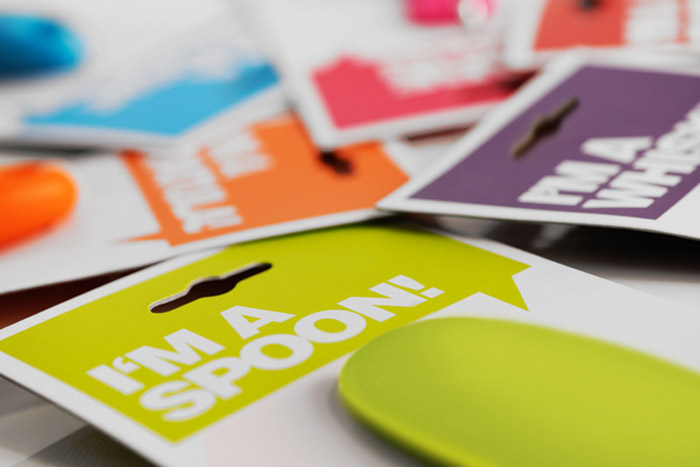
The Zing! logo / brand style was created with the tagline "Add a touch of Zing to your cooking and a splash of colour to your kitchen.". In order to add perceived value and desirability to the product each item was characterised by the use of a speech bubble stating "I'm a ...." incorporated onto the packaging to use personification as a unique marketing tool.
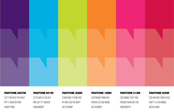
The striking packaging was designed, from hanging sleeves and cards to acetate packs and colour boxes with cutaways. Product and Art Direction was important to ensure the overall feel of the brand was consistent across not only the physical product but also the photography and marketing literature. This consistency makes Zing! a strong brand that makes the products eye-catching and recognisable as part of the overall product range.


Disclaimer: Some images hosted on this blog have been collected from external research associates to be presented as stimulus to those seeking news from the cutting edge of packaging. The imagery is not being presented as our own and copyright still belongs to the owner/creator of said work.
No comments:
Post a Comment