+More
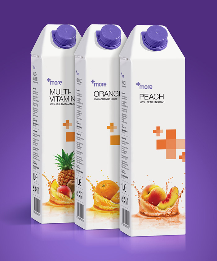
+More is a premium fruit juice which contains a high percentage of real fruit extracts. The plus (+) icon on the simple packaging is used as a symbol to indicate the rich fruit ingredient of More; it also changes colour according to the flavour. White is used all over the packaging. These both emphasise the healthiness and trigger the perception of hygiene. White also differentiates the packaging from the other fruit juices on the market. The simplicity of the package is an advantage. Illustrations are effective but do not distort the overall simplicity.
Disclaimer: Some images hosted on this blog have been collected from external research associates to be presented as stimulus to those seeking news from the cutting edge of packaging. The imagery is not being presented as our own and copyright still belongs to the owner/creator of said work.


No comments:
Post a Comment