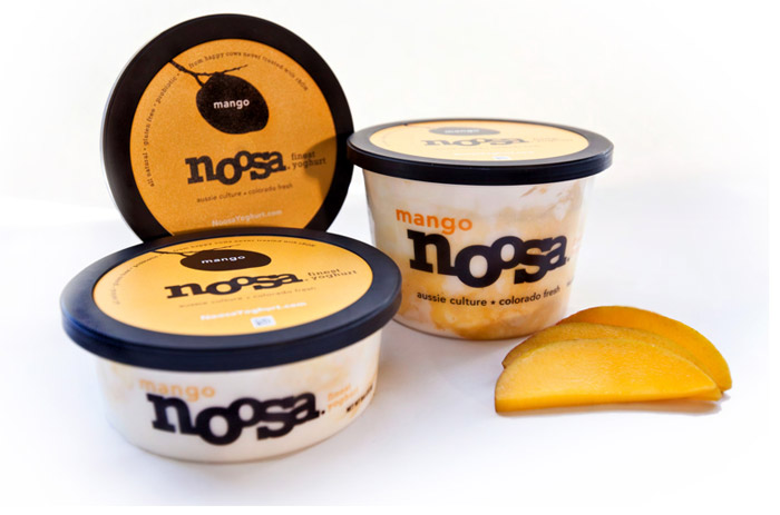
"We needed to make a bold impression on the shelf that would encourage people to pick it up. Clear, shallow tubs stand apart from traditional yoghurt cups and show off the products' fresh fruit beautifully."
A thick black logo type is visible from across the room. Its playful nature feels fresh and inviting. Silhouettes of juicy fruit stir-ins live on the lid, creating a richer experience as you interact with the product. "We played up colour and minimised busy-ness. The result was a true extension of the product itself – pure, creamy goodness bursting with jammy fruit. "


Disclaimer: Some images hosted on this blog have been collected from external research associates to be presented as stimulus to those seeking news from the cutting edge of packaging. The imagery is not being presented as our own and copyright still belongs to the owner/creator of said work.
No comments:
Post a Comment