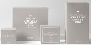
This packaging system needed to be distinctive, premium and reflect the attitude and ethos of the luxury home goods company.
It was not only necessary to develop the packaging to reflect the Restoration Hardware Baby & Child brand but also effectively communicate the company’s dedication to curating the best products on the market and attention to detail. The design solution for the hangtags and product packaging was to differentiate each item by developing a visual vocabulary subtly distinct to each line. Designs were seemingly influenced by the places from which products were sourced, yet without fundamentally changing the overall aesthetic of the system. Through the restrained use of colour and typography, the gift packaging and collateral serve to enhance the brand experience.
Disclaimer: Some images hosted on this blog have been collected from external research associates to be presented as stimulus to those seeking news from the cutting edge of packaging. The imagery is not being presented as our own and copyright still belongs to the owner/creator of said work.


No comments:
Post a Comment