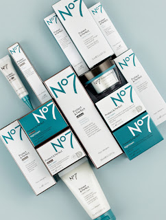
The rebranded No7 range of products (which hit the shelves in Boots stores a few weeks ago) is the result of four years work by Two Create on the project. The brief, they tell us, was to modernise the aesthetic to appeal to new users whilst not alienating loyal fans of the brand, and at the same time introduce more coherence across sub-categories and help improve product navigation at the point of sale.
"The project began in 2008," explains Two Create's Lucy Snowdowne, "with the team of creatives working on No7 (us as the newly appointed designers, store designers, the advertising agency, external PR team, internal brand guardians, the technologists and scientists) spending three days together to evaluate the brand and formulate an all encompassing brief for the relaunch.
"From there we worked with No7 on various design directions and visualised concepts which we showed across the UK to women that used the brand as well as some that didn't," Snowdowne continues. "We opened up a conversation and evaluated what women thought of our ideas at every stage of design development. No7 users reviewed our ideas on material finishes and product shape, and handled prototypes and discussed beauty regimes.
"The research not only steered elements of the structual packaging design, but also gave us an insight into the way women navigated beauty products instore and at home, which allowed us to devise new systems for the range. We assigned colours to skin types, grouped products into families and ensured that variants such as 'day' and 'night' were easily distinguisable both in out of their cartons."
The design studio also created a series of brand principles on which each of the 70 different brand packaging formats have been based and made a few changes: pewter replaces gold on various brand packs with a range of colours introduced to visually differentiate between products designed for different skin types and product categories. The logo itself (which remains unchanged) appears larger than it used to and is cropped on cartons which suggests a bold new brand confidence.
Disclaimer: Some images hosted on this blog have been collected from external research associates to be presented as stimulus to those seeking news from the cutting edge of packaging. The imagery is not being presented as our own and copyright still belongs to the owner/creator of said work.


No comments:
Post a Comment