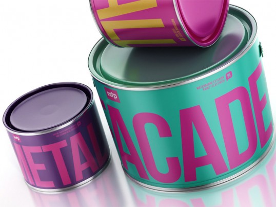
Process: How to create a brand that stands out? They needed to find the design solution that hadn’t been used by any of their competitors. At the same time showing the main features of the company – friendliness, quality and innovation. WTP is not just a manufacturer of paints – it’s an assistant, always ready to help, suggest and defend from the hassles and problems. Repairs with WTP is simple, convenient and fast and this is what in it’s simple design.
Results: No doubt, WTP is the most friendly and remarkable brand of paints on the shelf now. WTP has no corporate colours – it has the corporate identity, common for each design element – from business cards to packaging. Every item is bright and memorable combination of colours and objects that all together form whole the entire brand. The next step is to prove that the product is as high quality as its outer shell. But this is another story.


Disclaimer: Some images hosted on this blog have been collected from external research associates to be presented as stimulus to those seeking news from the cutting edge of packaging. The imagery is not being presented as our own and copyright still belongs to the owner/creator of said work.
No comments:
Post a Comment