The large bold type and simple imagery give the package a look of simplicity and modesty, ultimately giving it a bit of a higher-end makeover. The substrate is recycled paperboard, with plastic bagging on the inside encompassing the contents. The design is inspired by different activities that would suggest prestige or higher class.
Monday, 5 March 2012
Nabisco's Teddy Grahams
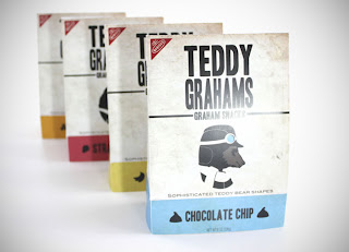
Though the child-targeted design of Nabisco's Teddy Grahams may not stop many, if any, adults from picking up a box for themselves from the grocery store, the aim of this brief was to appeal to an older audience.
The large bold type and simple imagery give the package a look of simplicity and modesty, ultimately giving it a bit of a higher-end makeover. The substrate is recycled paperboard, with plastic bagging on the inside encompassing the contents. The design is inspired by different activities that would suggest prestige or higher class.
Disclaimer: Some images hosted on this blog have been collected from external research associates to be presented as stimulus to those seeking news from the cutting edge of packaging. The imagery is not being presented as our own and copyright still belongs to the owner/creator of said work.
The large bold type and simple imagery give the package a look of simplicity and modesty, ultimately giving it a bit of a higher-end makeover. The substrate is recycled paperboard, with plastic bagging on the inside encompassing the contents. The design is inspired by different activities that would suggest prestige or higher class.
Subscribe to:
Post Comments (Atom)


No comments:
Post a Comment