"Logo and labels designed for Botanica wines from South Africa by Estudio Clara Ezcurra.The name of the wine and design of the labels are inspired in Mary Delany’s work, a remarkable series of botanical collages that are beautifully crafted with hundreds of tiny pieces of cut paper. Mary was 72 when she created these pieces in the late 1700’s and the use of some of her work was licensed to create these labels with her art as the primary focal point."
Disclaimer: Some images hosted on this blog have been collected from external research associates to be presented as stimulus to those seeking news from the cutting edge of packaging. The imagery is not being presented as our own and copyright still belongs to the owner/creator of said work.

Tuesday, 16 November 2010
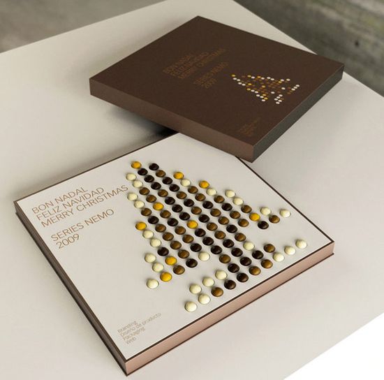
Countdown to Xmas with Chocolates - Stunning Idea
A nicely designed countdown to Christmas promotional calendar. Designed by Spanish design studio Series Nemo.
Disclaimer: Some images hosted on this blog have been collected from external research associates to be presented as stimulus to those seeking news from the cutting edge of packaging. The imagery is not being presented as our own and copyright still belongs to the owner/creator of said work.
Wild
"Stream Foods has launched a new range of wholefood snacks, designed by Springetts. The Wild brand comprises six exotic mixes, each reflecting a unique culture and culinary tradition."
"Springetts brief was to create a new brand identity that would bring to life the unique product proposition, engage consumers and differentiate the range from the broader competition.
Wild animal illustrations (snake, tiger, jaguar, coyote, macaw and lion) that emanate from and evolve out of the product photography were chosen to capture the exotic propositions and the exotic product delivery.
Springetts also developed the names for each variant (Aneeq, Bonito, Sabroso, Leziz, Aroi, Zarico), to add intrigue and emphasis to the exotic sources of the blends.
'We wanted to create a brand with real personality and to provoke a reaction with a pack design that was really arresting on shelf…an effect enhanced with range blocking,” says Moyra Casey, creative director at Springetts.'"
Disclaimer: Some images hosted on this blog have been collected from external research associates to be presented as stimulus to those seeking news from the cutting edge of packaging. The imagery is not being presented as our own and copyright still belongs to the owner/creator of said work.
"Springetts brief was to create a new brand identity that would bring to life the unique product proposition, engage consumers and differentiate the range from the broader competition.
Wild animal illustrations (snake, tiger, jaguar, coyote, macaw and lion) that emanate from and evolve out of the product photography were chosen to capture the exotic propositions and the exotic product delivery.
Springetts also developed the names for each variant (Aneeq, Bonito, Sabroso, Leziz, Aroi, Zarico), to add intrigue and emphasis to the exotic sources of the blends.
'We wanted to create a brand with real personality and to provoke a reaction with a pack design that was really arresting on shelf…an effect enhanced with range blocking,” says Moyra Casey, creative director at Springetts.'"
Disclaimer: Some images hosted on this blog have been collected from external research associates to be presented as stimulus to those seeking news from the cutting edge of packaging. The imagery is not being presented as our own and copyright still belongs to the owner/creator of said work.
Vaquitas de Chocolate
Estudio Clara Ezcurra designed the packaging for these cow shaped chocolates filled with milk jam. "The box should be appealing to be bought as a souvenir at the gift shops in Argentina. As our country is well known for the quality of cows and their produce, our choice was a cute illustration in warm browns with country colors in a cockade."
Disclaimer: Some images hosted on this blog have been collected from external research associates to be presented as stimulus to those seeking news from the cutting edge of packaging. The imagery is not being presented as our own and copyright still belongs to the owner/creator of said work.
Frank
"Frank is an Austin, Texas mecca for bacon-lovers, beer-guzzlers and encased meat enthusiasts. I worked collaboratively with the team of owners to build a “third place” accessible to a diverse range of patrons, from tattooed hipsters to senators, local celebs and blue-collar workers hungry for a dog. Sausage is not a modest food, and the brand collateral reflects its pride and majesty. Our goal was not just to create a celebration of food, but to also build a culture and community."
Disclaimer: Some images hosted on this blog have been collected from external research associates to be presented as stimulus to those seeking news from the cutting edge of packaging. The imagery is not being presented as our own and copyright still belongs to the owner/creator of said work.
Subscribe to:
Posts (Atom)


